It's been a while since I last had two minutes to myself to post something. It seems like I have been either lecturing, being lectured or on a train going to a lecture for the whole of the last two weeks!
On Wednesday I gave a talk on visual grammar (on Thursday I listened to a talk that pointed out how silly it is that all our words for understanding pictures are borrowed from terms for the understanding of words!). In particular I concentrated on how artists can shape our perception of an image by altering how the content is framed and what our point of view is. Perhaps when it is not so late at night I will go into it in more depth but here is the premise...
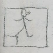
In any given image we have a certain amount of content. For example, we have a person and a block. Perhaps the person is walking down a step?
How much space we allow this person and this block will affect our understanding of them. In this image it may seem that our character has made a drastic choice...
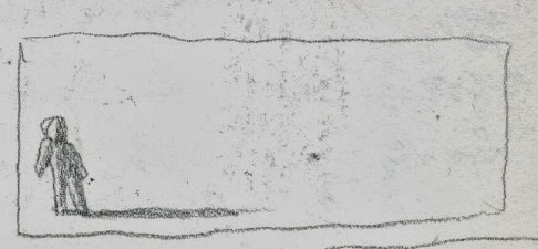
In this one it might seem like he had no other option!
Point of view changes meaning too. Here we are witnessing a tragedy:
Here we are participating in one:
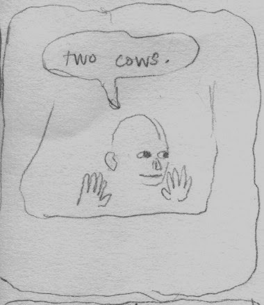
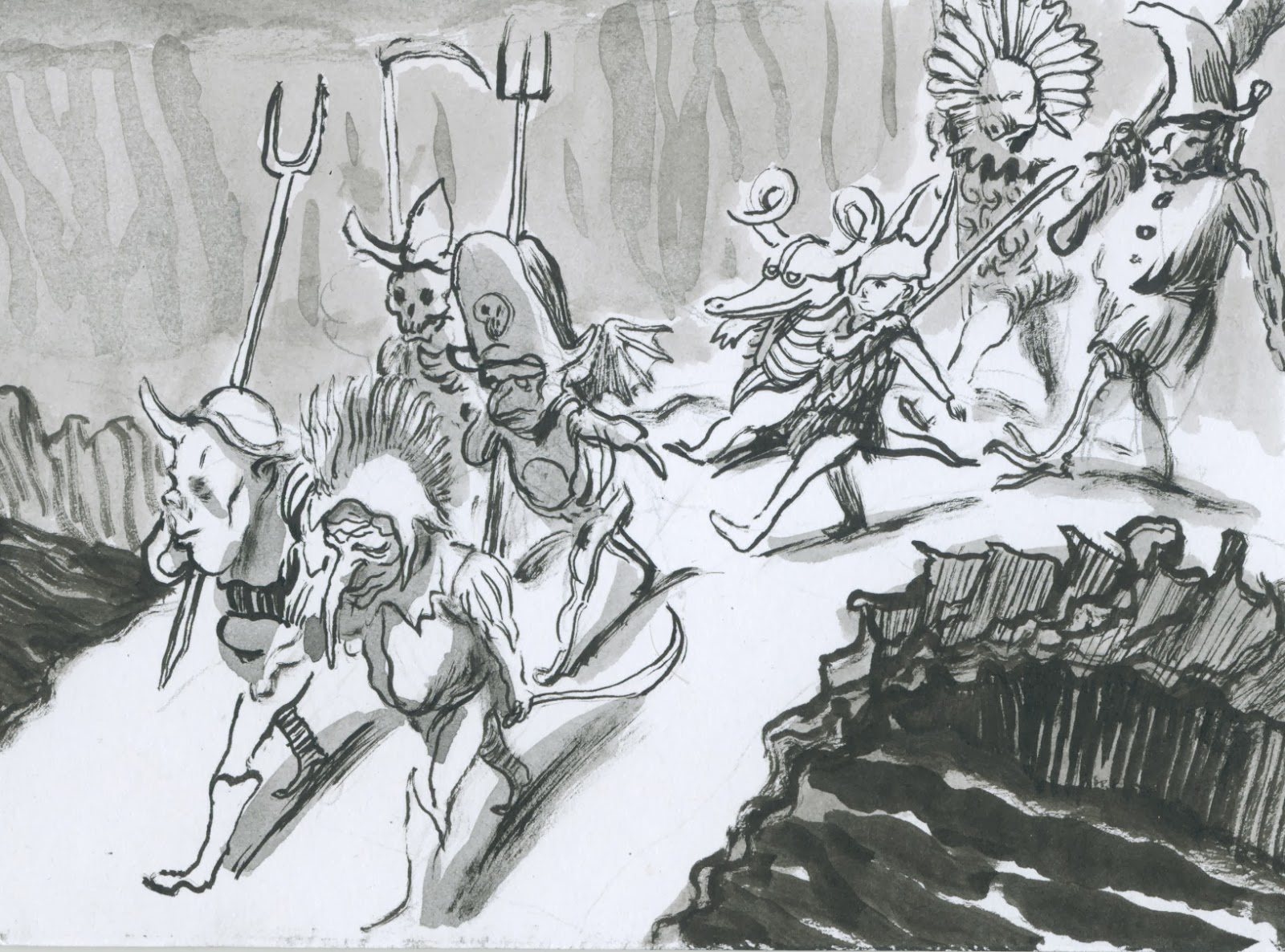
Even if there is absolutely nothing going on, the amount and the shape of the nothing are still important!
This person is in a very different place from the one above:
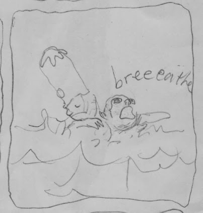
This place is different again:
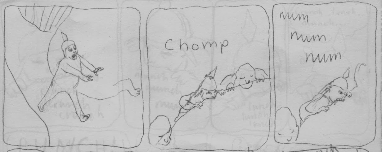
And again....
And again...
As an example of how we can apply this, even when working from observation, here is a drawing I made with my right hand of Javier Saez Castan giving a lecture. There is plenty of information about him but you would never guess he was talking to an auditorium filled with hundreds of people:
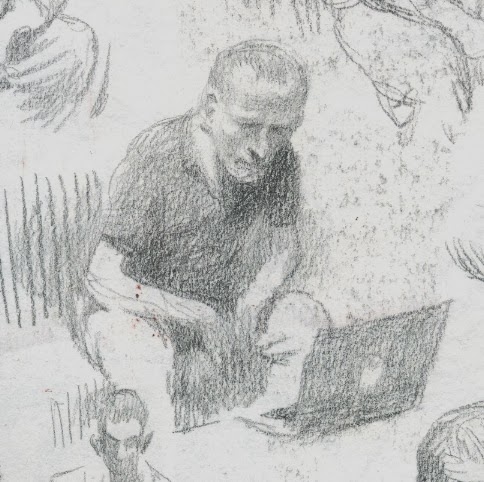
Now here is one with my left hand of Martin Salisbury giving his inaugural lecture yesterday... this time we get very little information about his appearance and a lot more about the space he was in. The fact that I'm not so confident with this hand doesn't really get in the way because the picture depends on its content and not its mark making. Narrative images don't need to be drawn with pretty lines to tell compelling stories... although admittedly it does help sometimes!
One picture shows a lecture the other doesn't. It's not that one is right and the other wrong but their stories are different. The longer I work the more I come to realise how much each and every choice we make can change the way our images are perceived.