Sunday 30 June 2013

a room

I found this description of a room in an old sketchbook and liked it:

The cabin was small, even for a very small person.  The sheets were greasy.  The blankets seemed to be made entirely of hairs.  The hairs were all squashed together but they tried to escape at every opportunity.  They prickled and they scratched.  Above the bed, massive things moved around in pipes.  There was a light.  The light didn't reach the corners.  Things lived in those corners.  If you stayed still they came out and went exploring.  They moved very quickly.  They looked too big to squash.  The floor was red.  Everything else was grey.  Some things had been born grey, some had been painted grey, others had achieved greyness.  A previous occupant had drawn something on the door, with his fingernails possibly.  The subject of the drawing was unknowable.  Beneath the marks was a solid lock of steel.  It was sealed.


Also fits the pattern mentioned in the previous post, I note...

the embarrassing mind

There is something that you notice about yourself when you've had to come up with story ideas for many years.  That is how embarrassingly revealing they are about your psyche.  I get very exasperated about how easy I find it to make up stories about lost, childlike things (or lost children for that matter), about kooky creatures who find acceptance just by being themselves or about magical beings who come and sort everything out for you.  I also do combinations.  Lately, I find the same story has got turned outward.  In Cheese Belongs to You and I am Henry Finch the question seems to be:  what the hell is going on out there anyway??
I guess I'd rather that than find I'd written American Psycho.  I do try and write other kinds of stories but they never work out... I suppose they lack authenticity ^-^.


Wednesday 26 June 2013

here's one I made earlier

Now that I am working on Jim's Lion again there is less stuff to post.  I want most of it to be a surprise... as I'm sure Walker Books do too ^-^ !  I will try and stay regular though.  ahem.   Might just be a bit more random...

Here are some pictures that I made for the Bell X1 album that we won't be using...


Perhaps this image shows what happens to that rabbit in the last post... or why they put him in the hat in the first place!

Tuesday 25 June 2013

Monday 24 June 2013

the bedside toys

The original title for While You Are Sleeping was The Bedside Toys.  That book was inspired by my lifelong love of toys.  At the time I was trying to come up with an idea for my next story and was getting thoroughly distracted by my discovery that underneath the layers of paint on Toy Biz Lord of the Rings figures was a perfect likeness of the actor... It took ages but I scraped the paint off each one and then repainted them myself.  I was so pleased with the result that I used to gang them up on my bedside table.  That was when I remembered how I used to choose a toy to watch over me at night when I was very small and that gave me the idea that eventually became While You Are Sleeping...


just remembered - the hobbits had hair made out of brillo pads ^-^!


Still very fond of the Lord of the Rings figures... think my eyes are too knackered for that sort of thing now!

Sunday 23 June 2013

trial by radio

UK based folks may have heard Memory Palace being reviewed on Radio 4 last night.  They were a bit ho hum about it, which was a shame.  They were especially down on those of us who had tried to do nothing more than illustrate the text.  I had hoped that this exhibition would get the discipline of illustration some much needed love...  drawing is my favourite thing in the universe.  I'm always a bit sad when other people don't seem to like it as much!

Before the exhibition opened, Isabel Greenberg and I were interviewed by students at the Royal College of Art for their own radio programme.  They were much nicer to us ^-^.  You can listen to it here.

Friday 21 June 2013

behind the scenes - part three

The ninth image in the sequence is taken from the middle row.  These images are in comic strip.  They recount the protagonist's interrogation.  In this picture, the last one in the row, he is taken away to be tortured... !

I began drawing everyone in charcoal, scaled so that they would fill the panel.


 I wasn't so keen on how that turned out.  I've noticed that if it is at all possible I tend to omit any contextual information from my drawing (like where the characters actually are!).  I forced myself to scale down the characters and add a little bit of information about the room they are in. 

As usual I started the drawing with the the focal point... no good working for hours only to mess that bit up!


That done, I added the rest of the characters and attempted a couple of staircases and a door.  Got to practise doing that sort of thing more often!


Moving on to the next row, I began with the image on the right then drew the other two.  The right hand one seemed the most likely to go wrong... but it didn't.  Hurray!  I think that little panel is one of my favourite pictures from the whole commission.  Curiously, when I look at it I think of the soccer player Michael Owen discussing his retirement.  That was playing on the radio when I drew it.  I listen to spoken word a lot when I'm drawing and I find that the two things get mingled in my mind so I can't see or hear the one without thinking of the other.  Viv pointed out that this is what they do in A Clockwork Orange!  


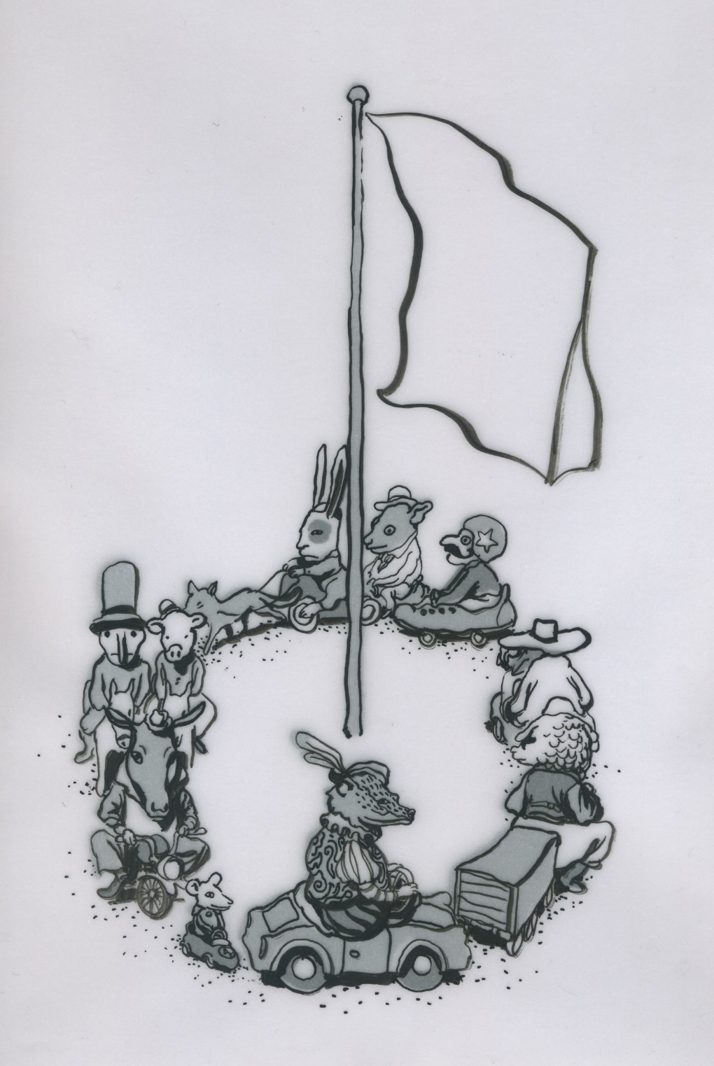
Now I had to do the last panel.  The previous lot had gone well so I started to get afraid I would ruin it.  This is never a good place to be when drawing ^-^!  I drew the character of the inquisitor first, thinking him the most important... and sure enough he went wrong, not catastrophically wrong just walking potato wrong.  I contemplated starting the whole thing again but that seemed like going a bit far so I just pressed on anyway and tried to lose him in a bit of a crowd.  


Finally I added the protagonist being dragged away in the background... here's how it turned out in the end:


Actually there is one little thing missing.  In the middle picture the inquisitor is holding a scrap of the periodic table when he asks, do you know what this is?  I almost forgot to add that before the piece went on display.

Wednesday 19 June 2013

behind the scenes - part two

This is the third image in the series.  In this one the protagonist is dressed up as a mockery of a civilized man by his captors...


My main bother with this one was to work out what would happen if he was lit from two opposite sides by the lamps, one near, one a little further back... I quite enjoy problems like that!

Once I had established where I wanted the lamps, I washed grey tone over the paper to see the shape of the composition and the location of the various elements.  I sometimes find this more useful than a pencil rough as it leaves all the specific marks for later whilst giving a very good guide to where stuff is going to go.


As with the first image I reached a point where I was happy with the picture aesthetically without it doing its intended job!  I had wanted to have the central character surrounded by his captors.


To that end I added another figure in the foreground.  The costumes of these guys are inspired by English mummers...


Tuesday 18 June 2013

Memory Palace - behind the scenes!

 So... Memory Palace opened last night and for the next few days I will be posting a selection of images from my work for the show.  I will show each image in stages as it was produced and talk a little bit about my intentions for the picture and what was going through my head as I made them!

This set shows the very first image in the sequence.  At this stage the prisoner is cooped up in a tiny cell...   With this image I wanted to establish some of the conventions I would be playing with throughout the commission.  Light was going to be important, I hoped.  Here I wanted the light through the window to be very bright and clear in the composition.  It represents the outdoors, which will ultimately be not a place of freedom but of torture.  I tried to keep the light on the deer-masked character clear too.  Throughout the commission I wanted physical light to be associated with moral darkness.  The Thing, the organisation holding him prisoner, want to revert humankind to their primitive, pre-cultural state.  I tried to reflect that through the juxtaposition of those opposites, as well as reversing the reading order for the whole sequence (it reads from bottom to top, sometimes right to left, sometimes left to right!).  I took my inspiration for the costumes (and for the various forms of torture) from British folk customs and this too was intended to suggest a society unraveling itself.

When it came to rendering the image I started with the protagonist because I thought he would be the trickiest to draw.  As I posted earlier  I did end up drawing him LOTS before I was happy.  It was the first picture I attempted so I wanted to set the standard as high as I could manage ^-^!


I drew the foreground characters in pencil (a water soluble one on damp paper so I could get a really dark mark) then added the Punch and Judy guards in watercolour only.   The chap in the deer mask is inspired by the Abbots Bromley Horn Dancers... and by Herne the Hunter in Robin of Sherwood ^-^


Now, I quite wanted to stop there because a little alarm was going in my head, as it often does, saying any more and you'll mess this up ... and I still think that if this piece was going to stand alone it would have looked better had I left it at that point.  I needed it to be part of the sequence though and it was supposed to be a very cramped and confined image.  At this point it just didn't really feel cramped enough...


...so I took the task very literally and stuck a box around it!  I was sorry to lose the more comfortable drawing above but if you see it with the others I hope you agree that the final image does the job it was meant to a bit better.

Sunday 16 June 2013

loopier

more Bell X1 t-shirt and screen print designs.  As before, will be colours; will be words...


Friday 14 June 2013

loopy

Might be that we do a screen print to go with the launch of Chop Chop... might look like this... only in colour... with words...


stunt elephants

Every book needs these.  Jim's Lion will have some.


Tuesday 11 June 2013

CHOP CHOP!

The cd version of Chop Chop is almost out... The band have also had this ultra limited edition chopping board version of the album made.  That is surely a world first?!


custom Beegu

Sarah McIntyre posted this picture of a knitted Beegu on her blog...


 I have one my sister made... and then there is this fellow:


He has taken it to another level! Awesome!  If anyone else has homemade Beegus (first time I've written that as a plural - looks odd doesn't it?) I would love to see!

Sunday 9 June 2013

s**t happening

Weirdly, one of the hardest things I have tried to learn is to draw things happening in my pictures.  For years, I would fill sketchbooks with scores of people and creatures just standing around in non-specific locations not really doing anything.  It is a terrible habit to get into because as soon as you want to tell a story with them all that practice counts for next to nowt...

In an effort to get over this problem I have taken to outsourcing my roughs to my left hand.  That way, if nothing is going on in the picture it becomes very obvious.  There is a big difference between a well-rendered drawing of someone standing around doing nothing and a wibbly lined scrawl of same.  There is just no hiding the lack of action!

Here are some of the preliminary drawings for Jim's Lion done this way.  I really like them!  Stuff is most definitely going on!


Tuesday 4 June 2013

trust the post

The Illustration Cupboard is having a show of illustrated envelopes next week (to go alongside the launch of Letters to Klaus).  I've just sent mine off... let's hope it arrives ok!


Monday 3 June 2013

grease is the word

From time to time I paint my drawing paper with oil.  It is a very sympathetic surface to draw onto and there is much fun to be had with the translucent quality it gives.

It does change a great deal over time though... here's what  a piece of oil soaked paper looks like after nine years:


  It's not translucent at all any more but there's some real nice texture to make up for it.  Maybe I could make drawings like whiskey - lock them up for a decade before showing them to anyone...
 

V&A Illustration Awards

Soonchild was shortlisted for best book cover this year... didn't win sadly.  Very high standard of work on show.  Illustration in this country seems to be in good health!  Also amazing canapes.  Bodes well for the Memory Palace private view.

It is a shame that Soonchild hasn't won anything.  I owe Russell Hoban such a lot. It would have been nice to get some silverware for him!

Will try again with Jim's Lion...

Saturday 1 June 2013

Loaf process - part two

So... the Loaf deadline was yesterday and here is the second part of my process for it.

After doing the thumbnail roughs and preparing the script alongside, I made a second rough for each page.  This time my main concern was to establish the shape and scale of images within the panels.  I also needed to make sure there was space for the text and check the horizon lines and vanishing points.  As far as possible I tried to avoid doing any drawing that would be repeated in the last version.  My test is usually, am I looking forward to drawing this? If the answer is yes then I will move onto the next one... If no (and time and patience allow!) then I will have another look.  The focus on the very first rough is all on the narrative and pacing, on this second one it is more about making sure things are expressed clearly and with potency.


When those were done I began to work on the artwork itself.  Because time was a factor on this project I used tracing paper to work directly on top of my second roughs.  I would put a couple of sheets inbetween to ensure that the line in the rough didn't get confused with the line in the artwork itself.  I  usually work in wax pencil or ink which cannot be erased but for this project I wanted to have the artwork for each page on a single sheet.  For that reason I used a regular HB pencil.  That way if I made a mistake it was very easy to rub it out and try again!

Here is an example of what these traced drawings look like


When I had made a drawing for each of the four pages I got to work on the last elements, the text, the speech bubbles and the flat tone.


Lastly I assembled them all in the computer... Here's how they came out: